
pt. 1
SVALBARD
◆
120 pages
◆
20240802
~
20241107
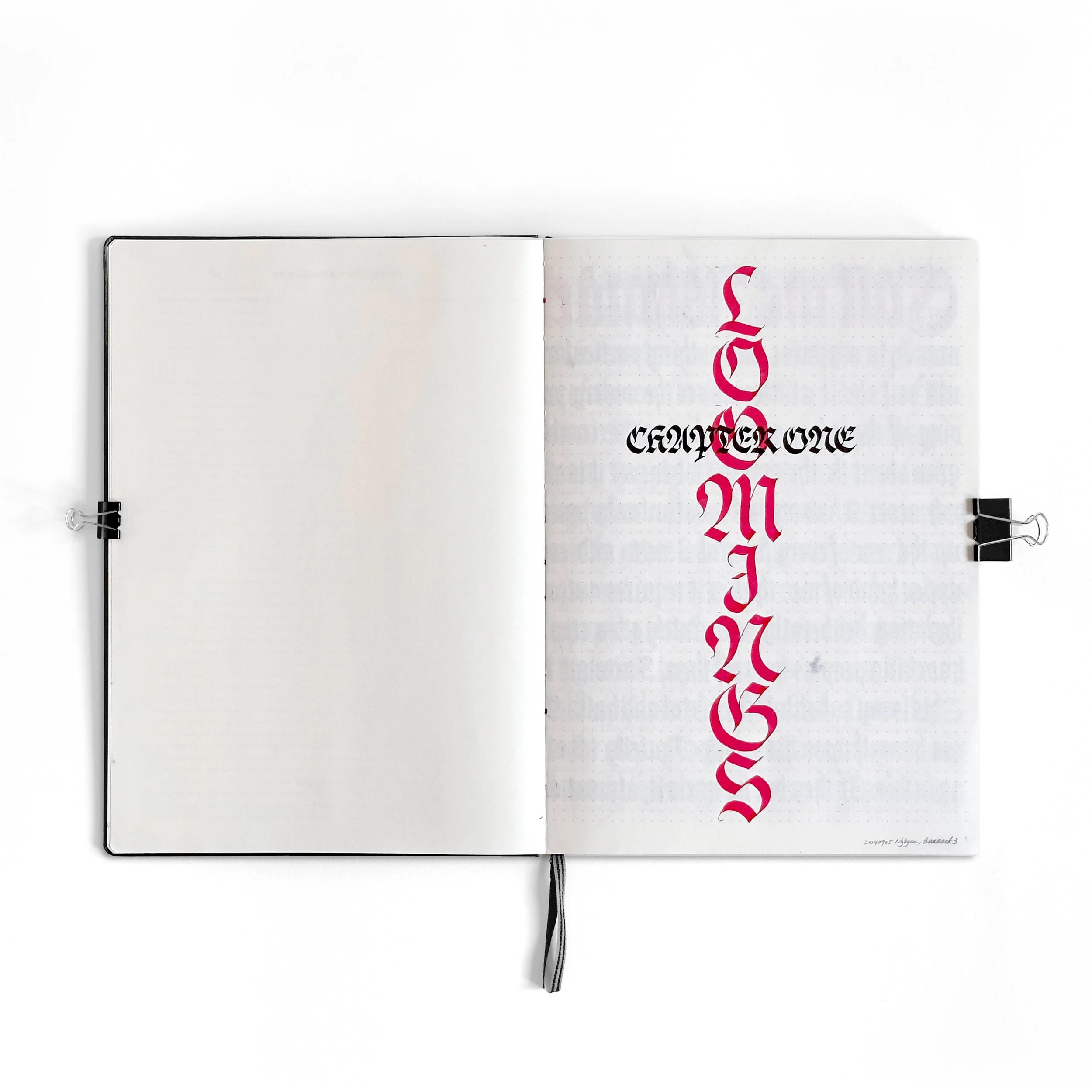
“Moby Dick is the Practice”
is a devotion to
the Virtue of Excellence.
By documenting my progression through scribing Moby Dick, it highlights the beauty of growth shaped by the unwavering power of dedication.

pt.1_overview
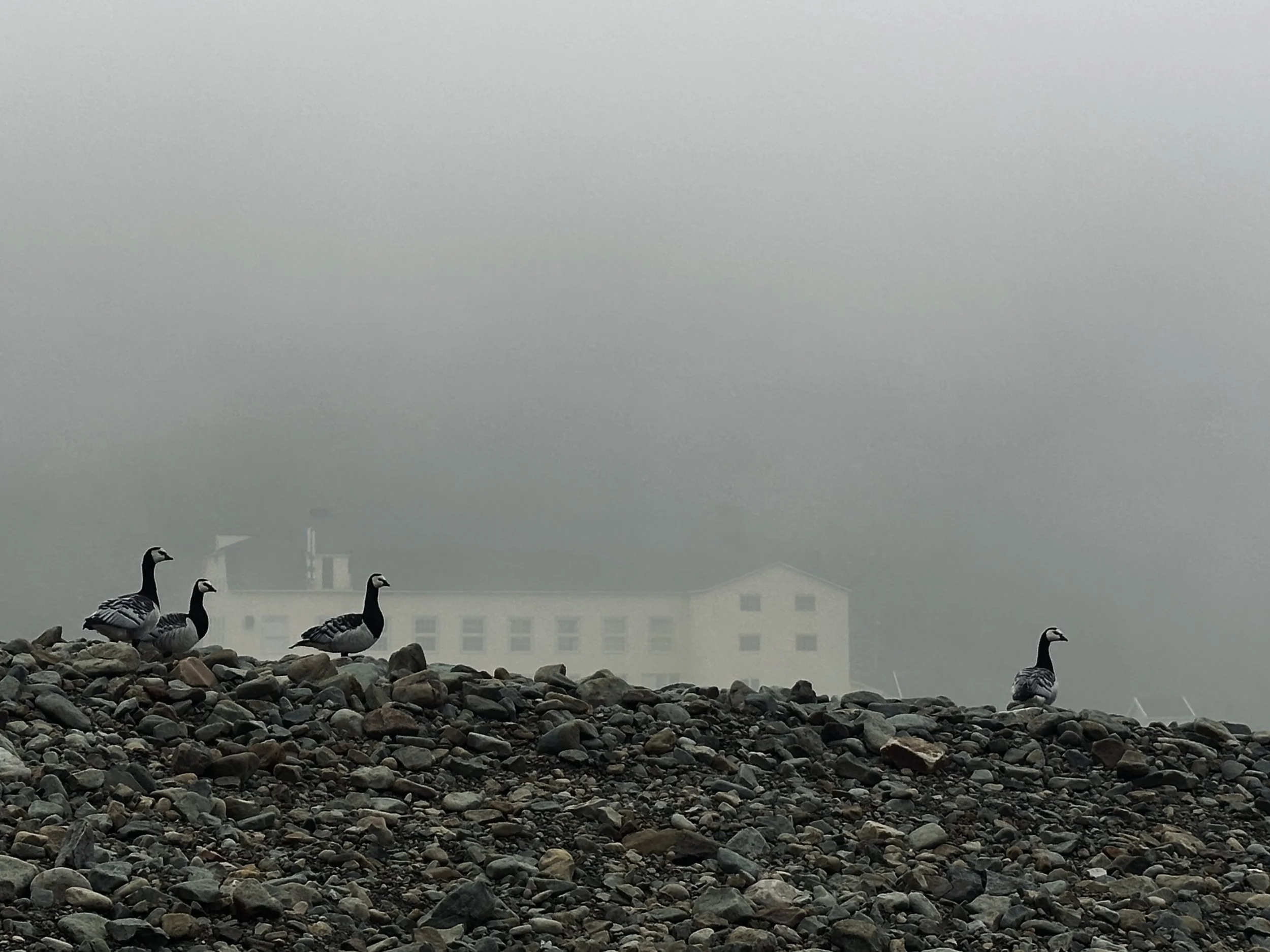
100 days of Svalbard
120 pages / 20240802 ~ 20241107
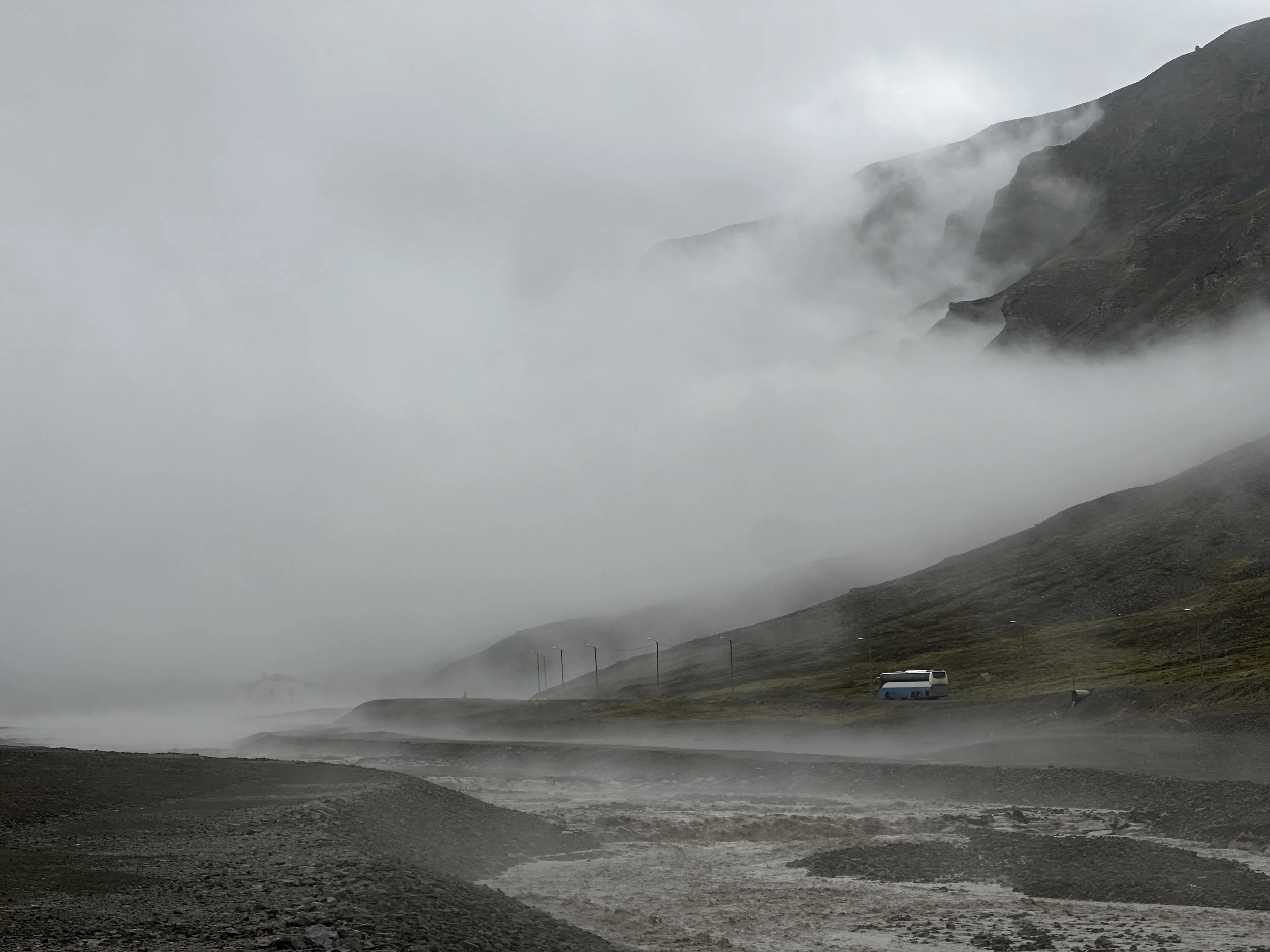
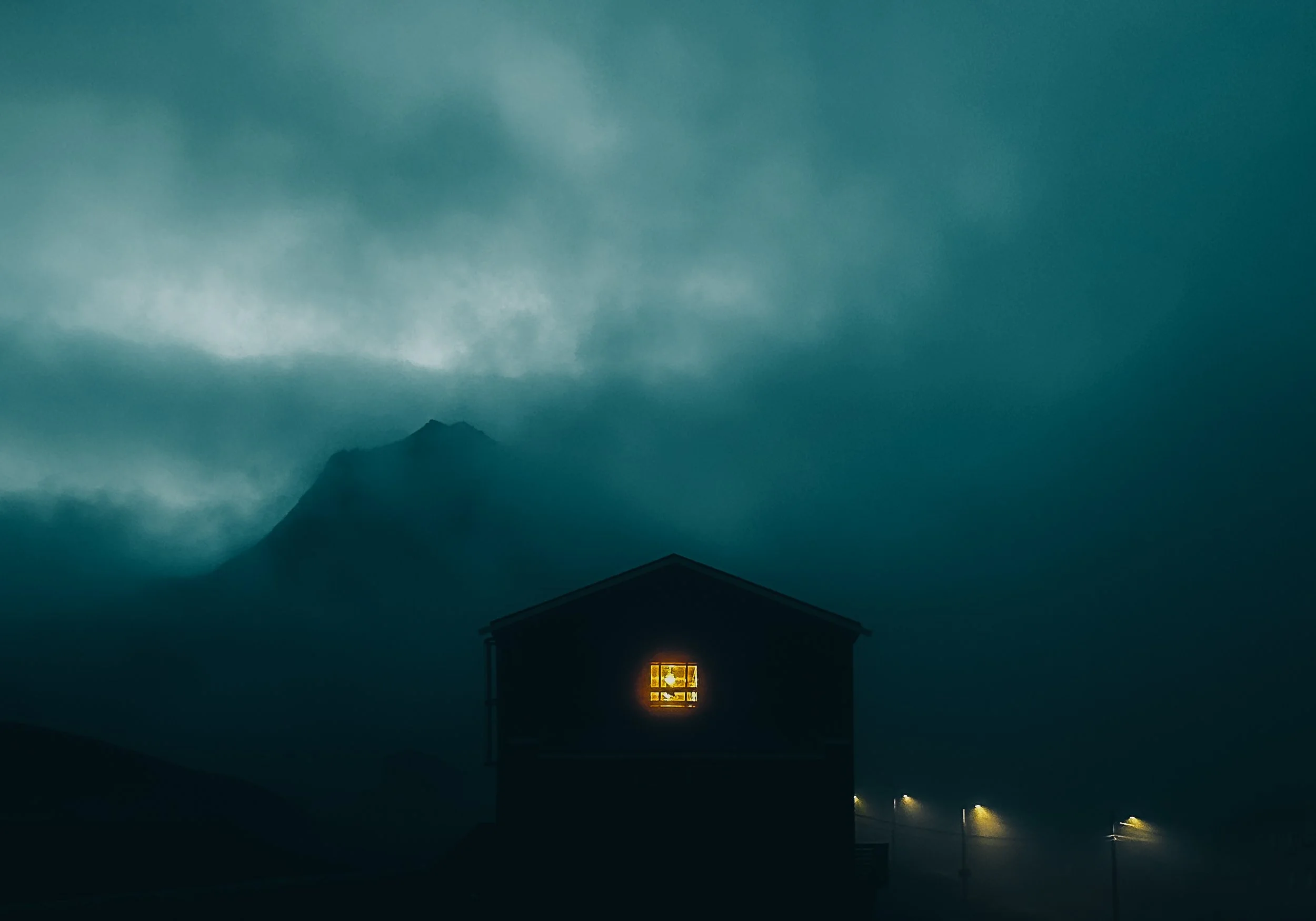
Spending 100 days in Svalbard gave me a rare chance to dive into a single creative pursuit—a luxury I hadn’t experienced since embracing a full-time nomadic lifestyle at the end of 2022. After nearly two years of constant packing, unpacking, and moving, my body craved the steadiness of staying in one place. Svalbard, with its vast landscapes and midnight sun, provided the perfect backdrop for a practice that demanded patience, discipline, and focus.
This project is about more than just writing letters—it’s an exploration of growth and dedication. Svalbard marks the first part of “Moby Dick is the Practice”. Inspired by an upcoming two-month sailing trip, I wanted to immerse myself in Moby Dick, a book I’d always been curious about, while deepening my calligraphy practice. Scribing the book became the perfect way to bring together two passions—reading and writing—through a focused, meditative exercise.
pt.1_dedication
kickstart
2040802
The decision to refocus on calligraphy came from a simple realization: after years of lettering practice, my growth had plateaued, and I felt less motivated. I’ve always credited calligraphy as the foundation of my lettering work, so I began to wonder—how might years of lettering now influence my calligraphy? Reconnecting with the craft felt like a way to push through stagnation and rediscover my creative momentum.
Svalbard’s stability gave me the space to dedicate myself fully to this practice. For the first time in years, I could establish a daily routine that balanced structure with creative exploration. A timely online workshop by Elmo sharpened my technique and reminded me to focus on the artistry of each stroke, while earlier lessons from Julian Waters’ blackletter workshop laid the groundwork for my return to this style.


pt.1_inspiration
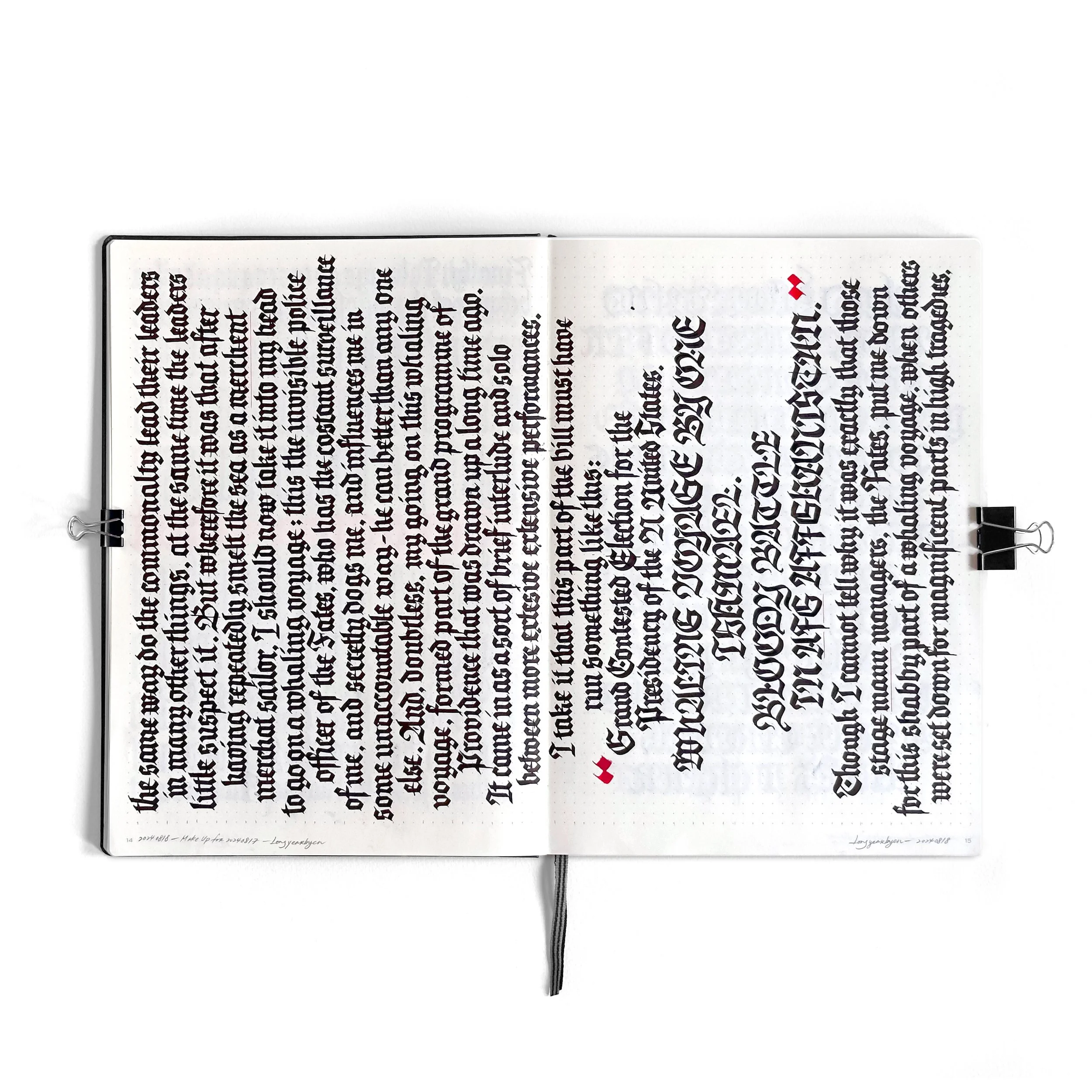
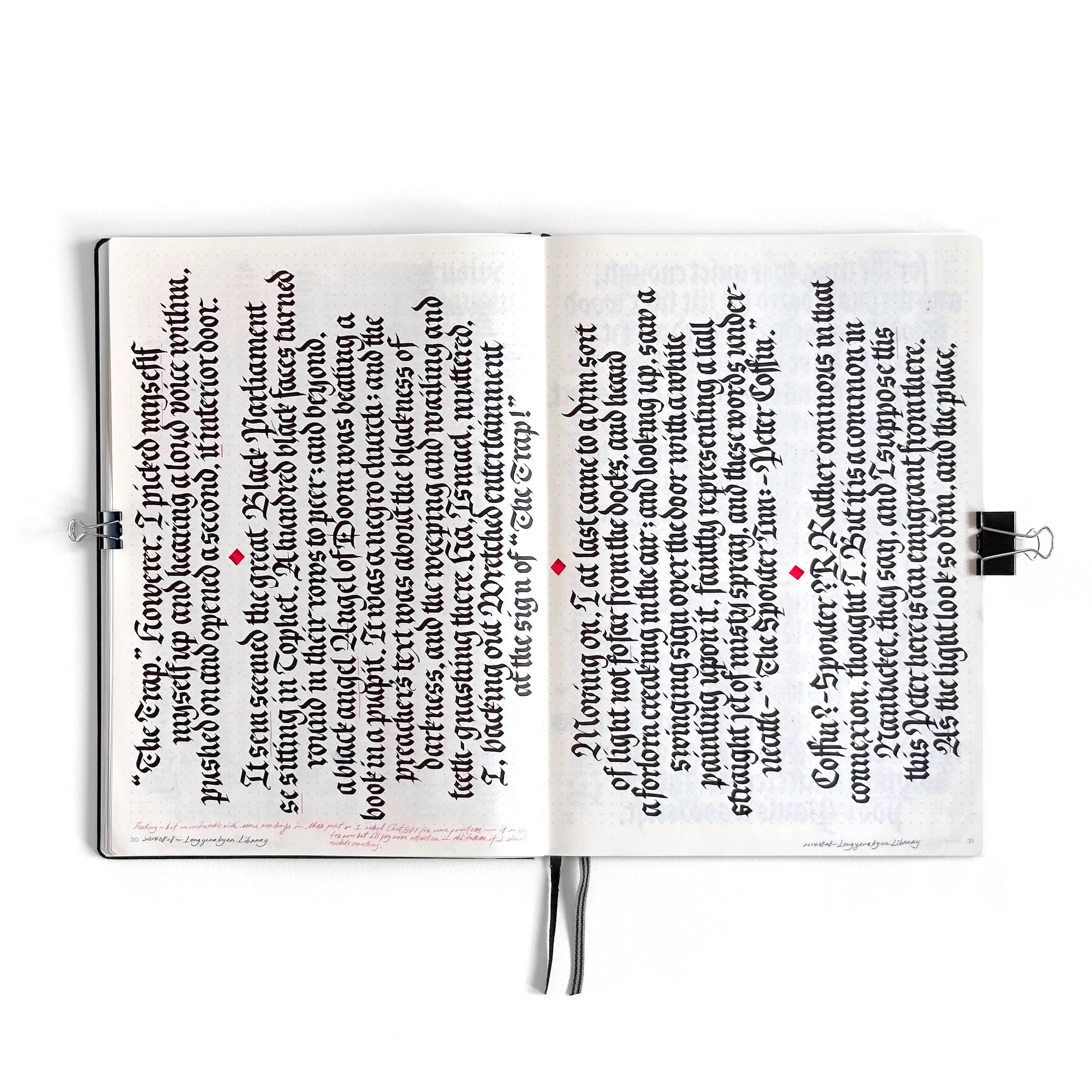
writing lines
20240802~
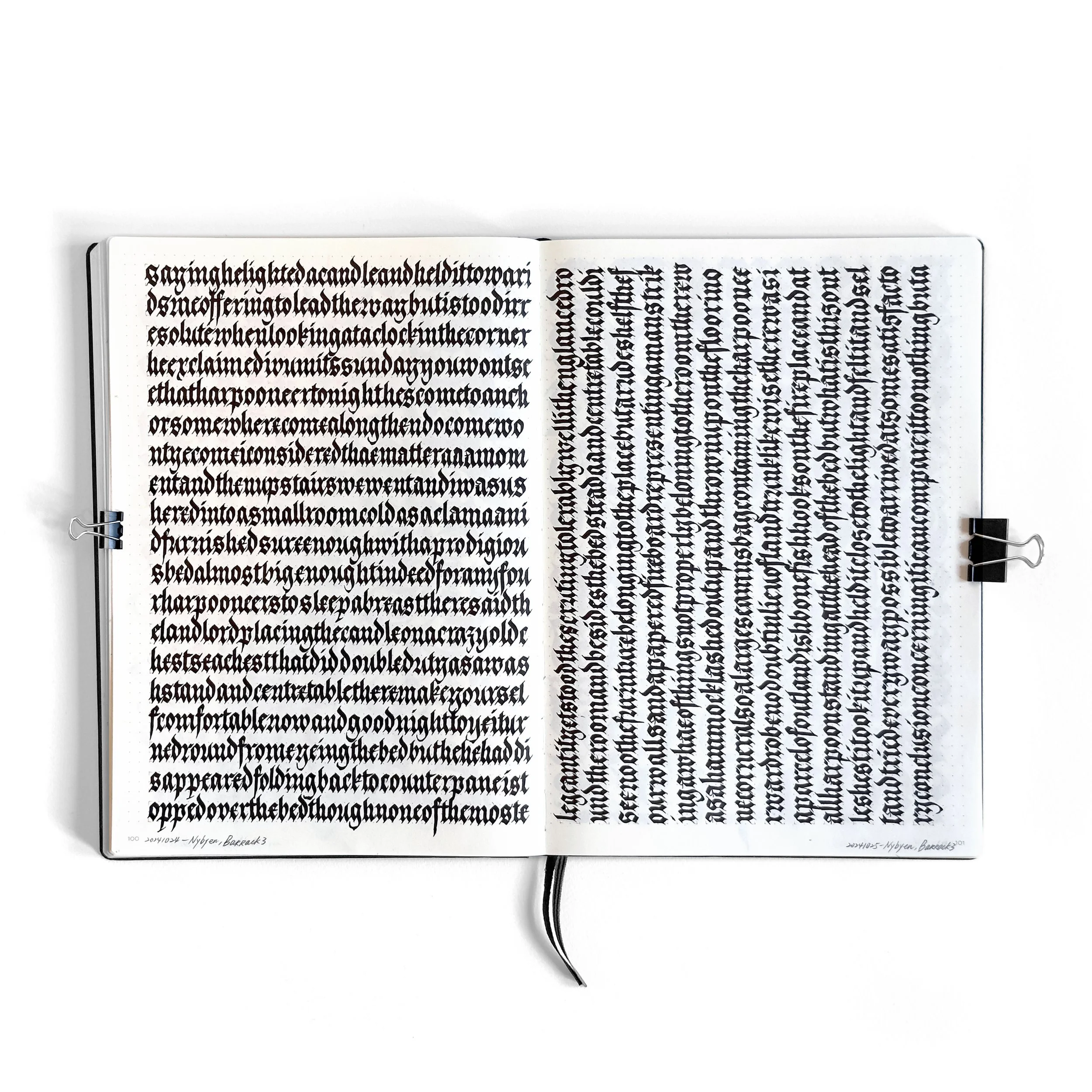
The early days of this project revolved around simplicity. I spent hours each day writing lines from Moby Dick, focusing intently on rhythm and structure. During this phase, I adhered strictly to traditional word spacing, letting the text unfold naturally as I practiced.
Getting into the groove wasn’t easy. After living with a looser schedule since the pandemic, it took effort to embrace the discipline. But Svalbard’s simplicity worked in my favor—fewer distractions meant more focus, and the midnight sun eliminated the pressure of feeling like I was missing out on the best parts of the day.
These weeks were as much about rediscovering the meditative power of repetition as they were about technical practice. Each session offered a chance to refine my craft and reconnect with the joy of creating through consistency and focus.

pt.1_dedication
routine
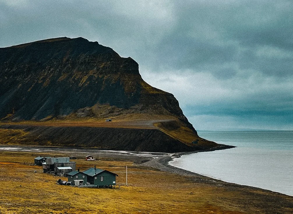
Establishing a daily routine was the cornerstone of this practice. Each morning began with a 2.5 km walk into Longyearbyen, where I sometimes treated myself to a croissant or scone. Occasionally, I indulged in a whimsical chocolate milk with a moose illustration—a small joy that became part of the ritual.
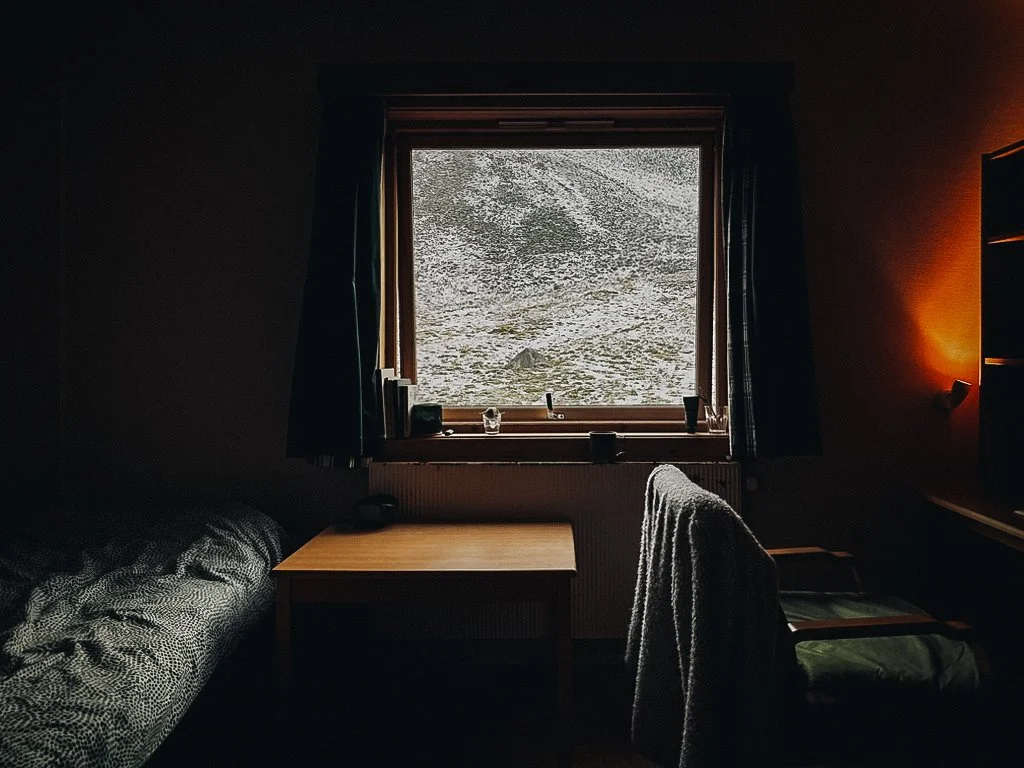
At first, I resisted the daily commitment, often searching for excuses to skip. But over time, seeing steady improvement transformed t←he walk into a meditative transition I looked forward to. My destination was the library, a warm and cozy space where I journaled, meditated, and devoted hours to writing.
Lunch breaks by the beach offered wholesome pauses, with the midnight sun and occasional beluga sightings adding moments of wonder. These natural rhythms refreshed my energy for the afternoon practice. By the time I returned to the library, I felt recharged and ready to dive back into the work.
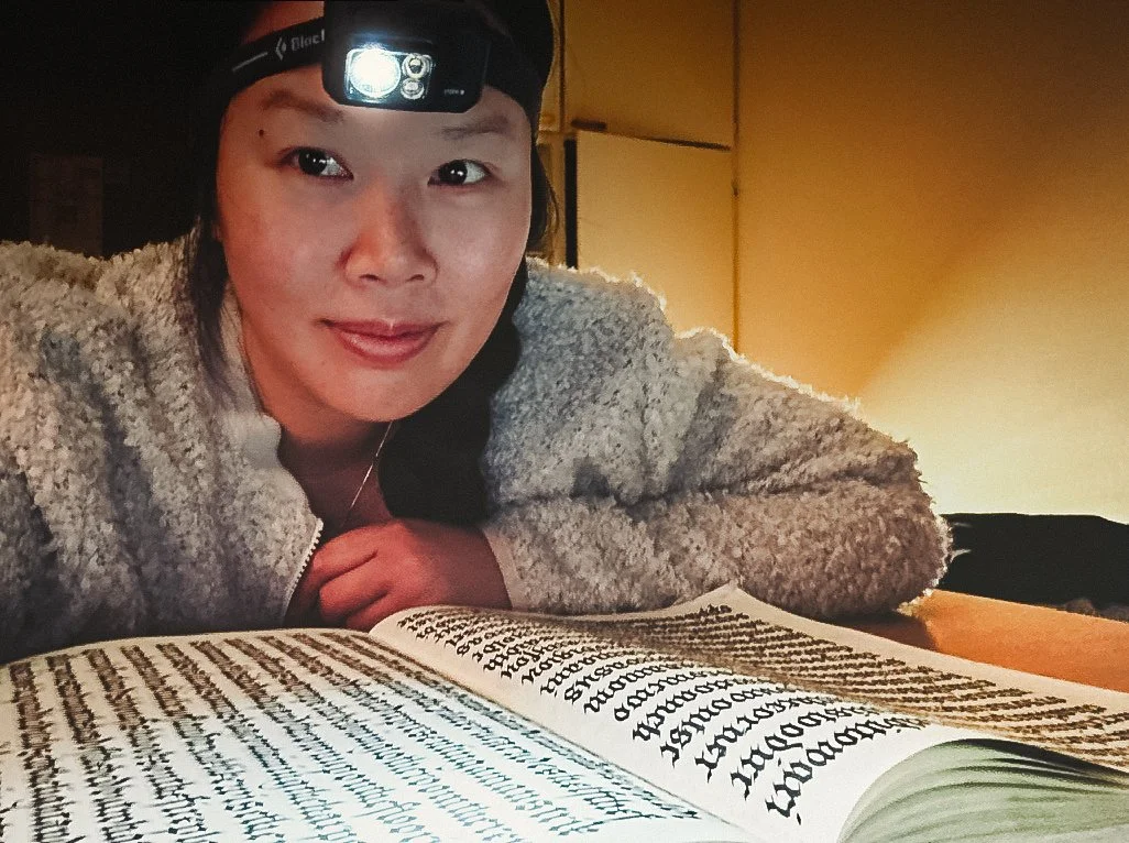
However, the routine became harder to maintain after the first sunset following 84 days of the midnight sun on October 25th. As darkness and coldness crept in, daylight diminished rapidly—by as much as 20 to 30 minutes a day. It became more difficult to leave the warmth of my cozy room to make the journey to the library. I tried to keep my practice at home, but it proved challenging. Disliking the harsh brightness of artificial lights in my room, I found a solution in wearing a head torch to write. This allowed me to continue practicing while preserving the cozy ambiance I adore.
What began as discipline evolved into fulfillment. Each pen stroke became grounding, transforming a simple exercise into a meditative ritual. The structure of these days deepened my connection to the craft and reaffirmed the value of routine in nurturing creativity.
pt.1_inspiration
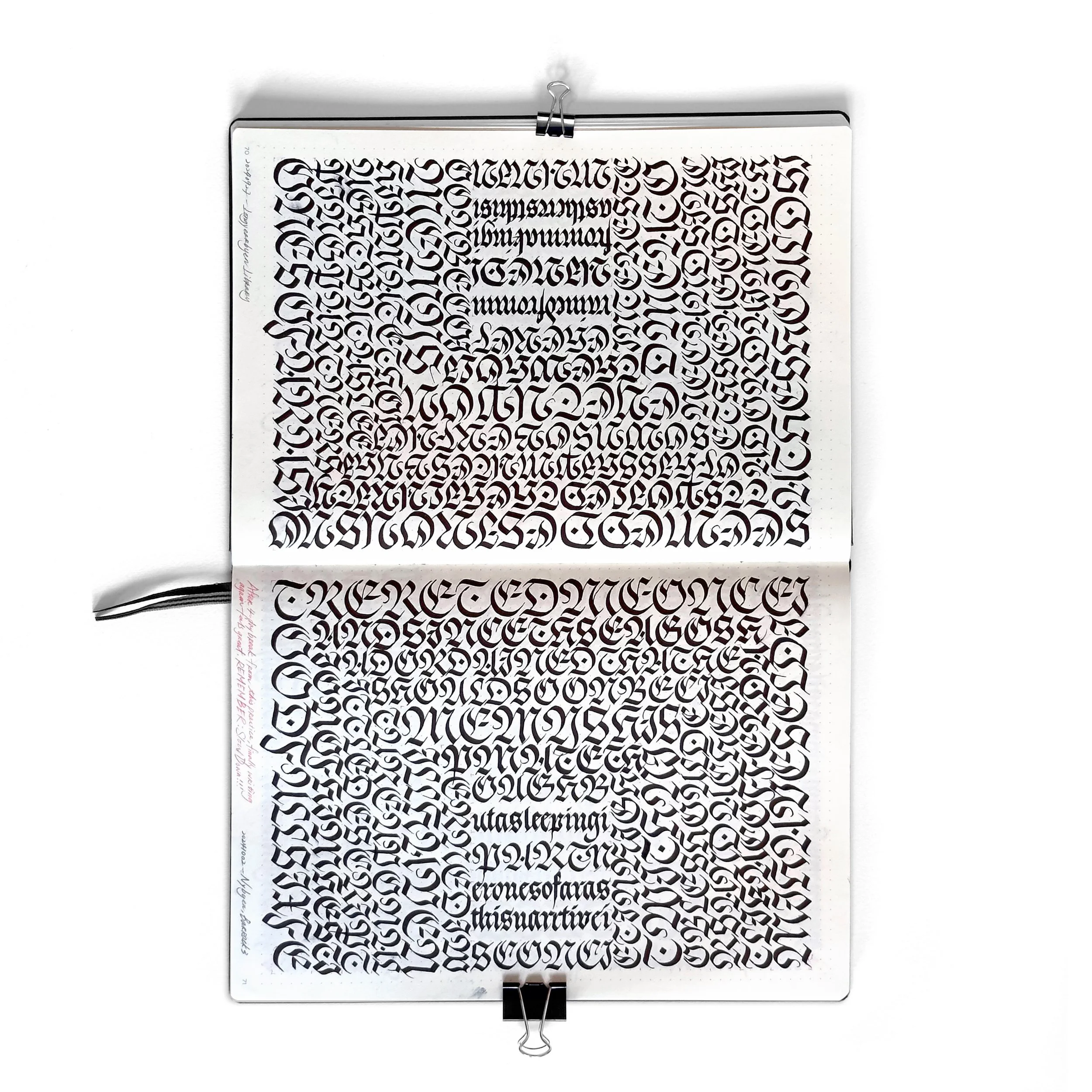
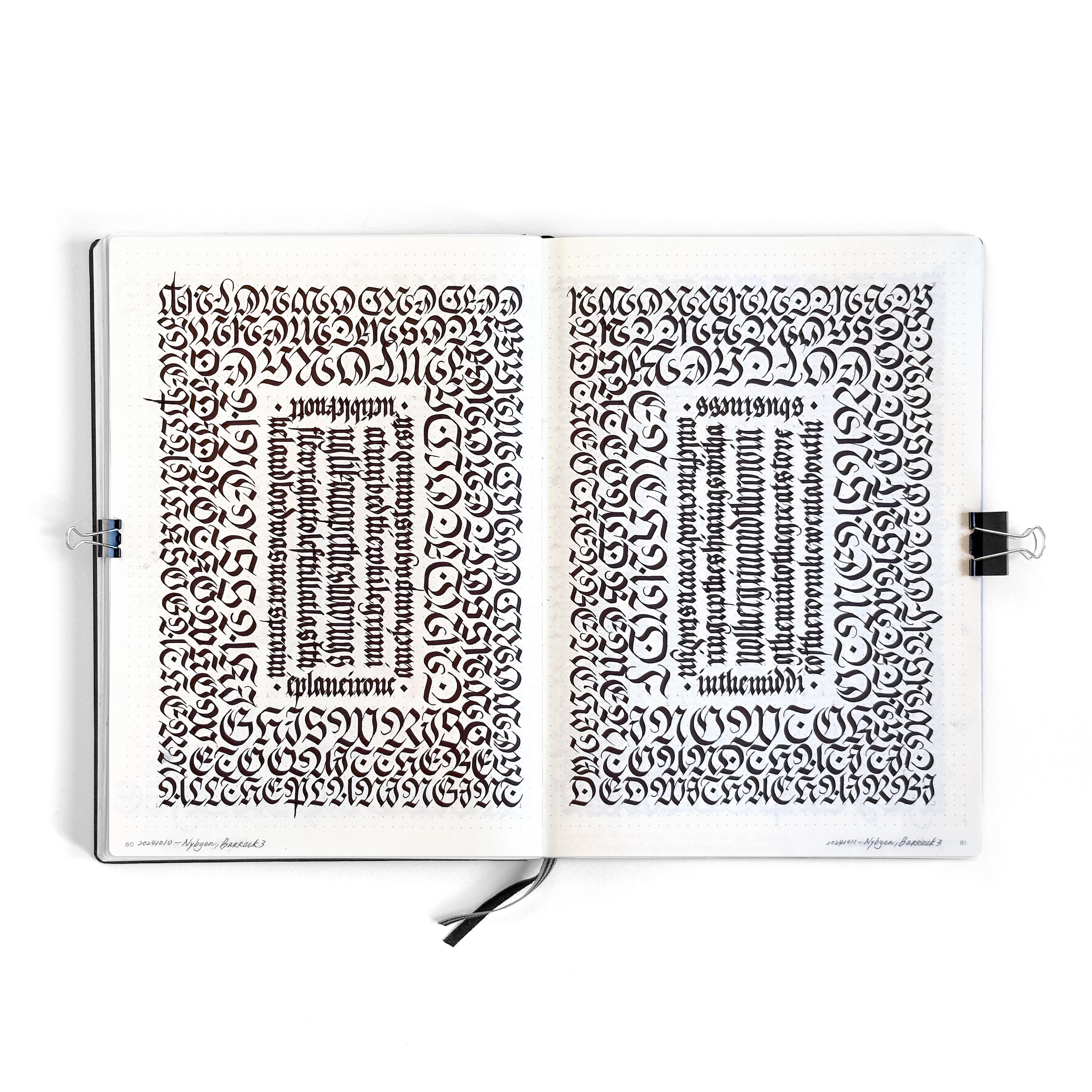
radial design layout
20240906 ~
The radial layout marked a significant turning point in my calligraphy practice. Born out of experimentation with linear writing, it combined practicality with creativity, blending my goal of refining letter combinations with a desire to explore dynamic visual forms.
Practical Structure
Using an A4+ dotted-grid notebook (Leuchtturm 1917) made the process surprisingly efficient. By counting the dots, I could create precise layout rules without constant measuring—a practical approach that streamlined the transition from linear writing to the radial format.
The radial structure also solved a common challenge: smudging. Writing outward from the center ensured my hand never touched freshly inked lines, preserving the clarity and sharpness of each stroke. This method allowed me to stay fully immersed in the flow of writing while keeping the layout clean and intentional.
Word Spacing and Even Texture
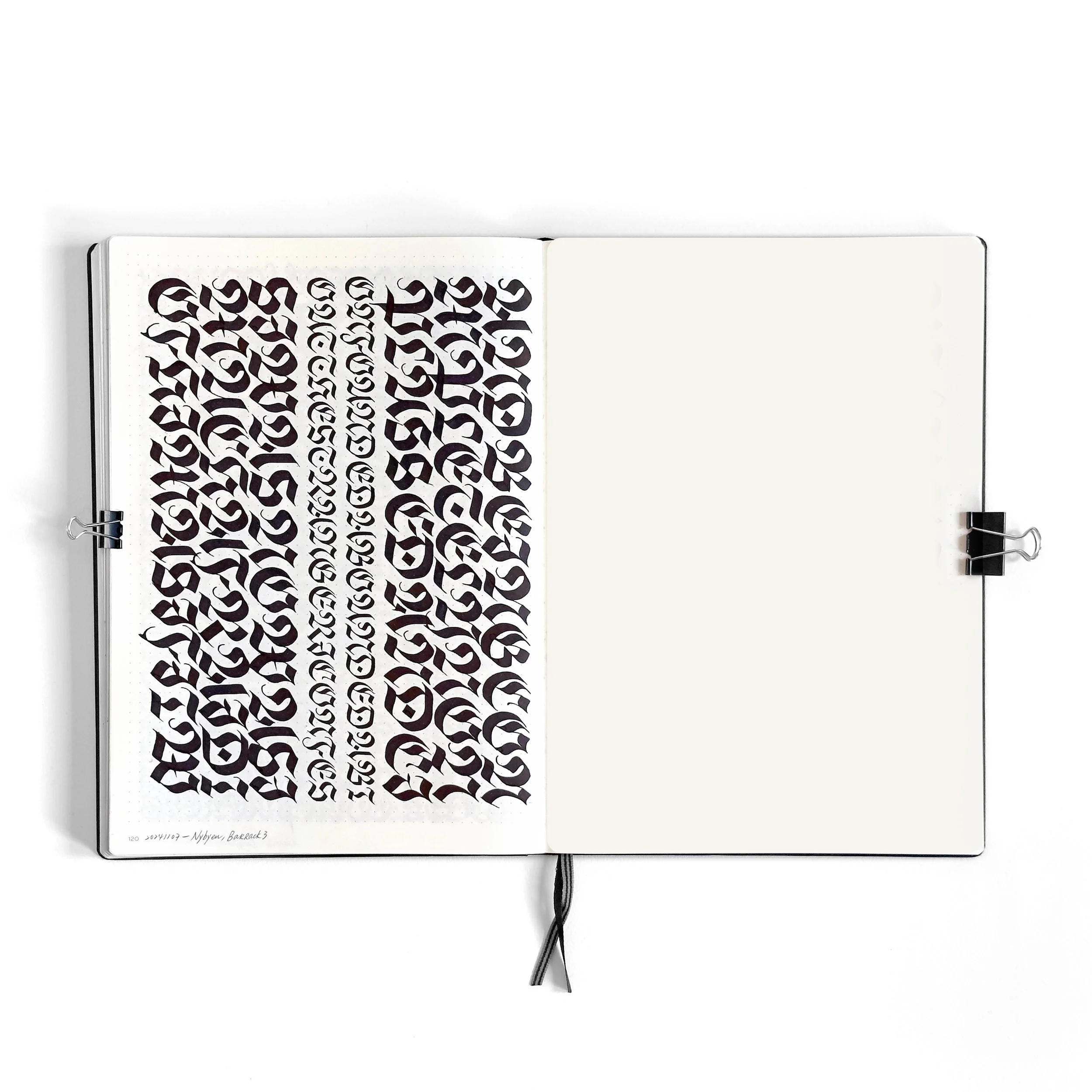
In the beginning, I adhered to traditional word spacing, letting the text unfold with readability in mind. But as I delved deeper into the layout, I became more focused on creating seamless textures. Gradually, I omitted word spacing entirely, prioritizing the rhythm and flow of letters over conventional readability. This shift resulted in intricate compositions where the letters formed a unified visual texture, inviting the viewer to experience the piece as a cohesive whole.
Layering and Color
To add depth and complexity, I experimented with layering techniques. I started with red ink as a base layer, over which I added black lettering to create interlocking designs that felt structured yet organic. When the red ink ran out, I explored alternative methods of achieving visual interest, such as combining different nib sizes within a single composition. This introduced contrast and hierarchy, adding a new dimension to the work.
Symmetry and Asymmetry
While many of my early layouts emphasized symmetry, I eventually ventured into asymmetry. These design decisions challenged me to create balance without mirroring elements on both sides of the spread. This shift allowed me to push the boundaries of the radial structure, exploring more dynamic and expressive compositions while staying true to the fundamentals of my craft.


pt.1_dedication
hitting page 100
20241024
One particular milestone stands out: comparing pages 6 and 100, both written with a 2.4mm nib, revealed remarkable progress. These pages embody the essence of this practice—dedication leading to transformation.
In the early stages, Elmo's workshop proved instrumental in guiding my improvement. It helped resolve ambiguities in my decisions around letterforms and set a strong foundation for my initial practice. By the time I reached page 100, the changes were undeniable: the shapes were more consistent, the rhythm stronger, and the black-and-white pattern sharper. This side-by-side comparison became a visual testament to the power of steady, deliberate practice.
This experience served as a reminder that good things take time. Embracing slow productivity and celebrating incremental progress reshaped how I view improvement, in calligraphy and in life—we are all on a path, going forward. Seeing this steady progress made me optimistic about the rest of the Moby Dick project. It left me excited to discover where this practice will take me next.
pt.1_inspiration
meditations
20241006 ~
The idea for Meditations grew naturally out of my work on Moby Dick. As I experimented with radial layouts and worked within the constraints of the A3 spreads in my book, I couldn’t help but wonder: how much bigger could I write? What would that look like? This curiosity—paired with a “because I can, I should” attitude—sparked the desire to scale up and explore writing on a larger canvas.
Inspired by Marcus Aurelius’ philosophical work Meditations, this project continues in the same blackletter style I’ve been practicing. Scaling up, however, brought new challenges. Drawing guidelines and making adjustments for inevitable mistakes became a valuable test of my patience and adaptability.
On the logistical side, I owe a special thanks to Ellen, the artist-in-residence at Artica, for helping me source the perfect large-format paper on the island, and to Jan and John, who tried and helped move a large table into my small room so I could work comfortably on this larger scale.
Meditations also marks a personal milestone—it’s my first-ever "artwork." This piece emerged naturally from practice, teaching me a powerful lesson: inspiration doesn’t grow from overthinking or endless planning but from simply doing. Sometimes, “just do it” really is the best approach to creativity.
Meditations is now a separate project, representing the creative growth sparked by Moby Dick is the Practice. It demonstrates how deliberate experimentation can lead to unexpected opportunities.

pt.1_conclusion
20241107
Svalbard provided the perfect foundation for “Moby Dick is the Practice”, allowing me to immerse myself in discipline, experimentation, and growth. This phase reinforced the value of routine and deliberate practice while sparking creative exploration that fills me with optimism for the journey ahead. As just the beginning of a much larger endeavor, this experience has laid the groundwork for what’s to come, and I’m excited to see where it will lead.
